Tuesday, December 6, 2011

Visual Techniques

Apple's iPod Nano Advertisement Design
Balance
Activeness
Boldness
Unity
Repetition
Exaggeration
Consistency

Apple's Macintosh Desktop Advertisement Design
Fragmentation
Economy
Activeness
Subtlety
Depth
Exaggeration

Both of the Apple advertisements represented above share many similarities and differences with one another. When it comes to similarities, both advertisements are highly active when it comes to movement. In the Nano ad, activeness occurs as the paint drips down from each ipod. With the desktop ad, activeness takes place as each desktop floats in mid air. Both advertisements also show exaggeration in their pieces. The Nano iPods are overly exaggerated with nine different colors of paint, so that each product creates a "pop-out" effect. The desktops are also exaggerated since the majority of the desktops are defying gravity, and as a consequence of that, the desktops seem to be larger and greater than what it really is. As far as their differences, the Nano advertisement represents unity, as each ipod is joined side by side as a whole. On the other hand, the desktop advertisement symbolizes fragmentation, since each desktop is separated and apart from each other. Furthermore, the Nano Ipods' boldness creates a strong, vivid appearance for its viewers. While the subtlety of the desktop ad uses a clever method of marketing its product. All in all, both advertisements are very successful in their visual techniques, as they spark interest with their marketing designs. 

Wednesday, November 30, 2011

Contrast

The photo above provides an excellent example of an effective use of contrast. Color contrast works effectively in this piece because there is a single, bright red flower standing along side in a vibrant, green background. In this example, colors that are opposite of each other contrasts strongly when they are in position with one another. The vividness of the red also creates a "pop-out" effect that is easily visible by the eye. The boldness of the red simply grabs our attention, as contrast sharpens this photo. Since there are only two colors presented in this photo, both colors accentuates the other. Most importantly, color contrast works better when few colors are involved. In addition, since green and red are the only colors existing in this image, the combination of colors provide larger color masses. 
The image above demonstrates a poor use of contrast. The use of the additional colors decreases the level of contrast in the image. Also, the image becomes overwhelming as each color clashes with one another. In order to achieve a high-contrast image, less colors should be used, so that the image's focal point will be able to stand out. Most importantly, the main purpose of contrasting is to sharpen an image, but since numerous colors are presented in the image, the image fails to grab the attention of the viewer. Besides being distracted by the many shades of hues, the different types/sizes of text and lettering in the image also adds to the image's poor use of contrast. Because of the different sizes of lettering, the audience cannot distinguish which words are of in most importance in the website. All in all, this image portrays a bad example of contrast since none of the colors compliment or accentuate each other. 

Sunday, November 13, 2011

Movement/Motion

The JAWS 3D sidewalk illusion above provides a perfect example of implied motion. As a result of implied motion, it seems as if the shark is fully aware of his surroundings and is ready for his meal. The water splashes surrounding the scene indicates action in the water. The texture of the water is decorated with scattered patches which denote movement as well. Furthermore, the implied motion of the shark results in a forcible separation of the bricks. The irruption of the bricks creates a "pop-out" effect and makes the picture come to life. In order for this 3D illusion to be successful in implied movement, a body should be placed in the shark's mouth. Once an individual is present with the shark, the picture becomes realistic, and implied motion takes place. Due to its heavy detail, and accuracy, activity and motion is easily detected.

In the photo above, the bronze statues also represents a perfect example of implied motion. Based on our prior knowledge of the world, we interpret these statues to be playing around with each other or jumping off of a monument. By the looks of his stance, the statue that is closest to the ground seems as if he has jumped off the monument with his legs apart and his hands wide open. Movement is also introduced as the statue directly above the jumping statue looks as if he is being pushed by the other sculpture. The statue being pushed has a surprised look on its face, which provides the audience with a sense of suspense as to what will follow. The statue viewing the commotion behind the ropes, serves as an indicator of movement. His interest in the scene adds to the illusion that some action is occurring. 

Thursday, November 10, 2011

Dimension/Depth/Space/Scale

The Alice in Wonderland movie poster above provides an excellent example of depth cues. Scale is present in this image as the tall, overgrown mushrooms dominate the poster. Also, as you look over to the right corner of the image, you can easily see the shadows of an oversized cat that has been altered to scale so that it provides comparison to the other characters presented in the poster. Since scale is involved, we can simply detect the main characters of the movie. The use of spacing on the poster also helps us understand where each character/object rests on the photo, and most importantly, space allows the audience to see a balance in dimension. The overlap of the characters and objects of this design provides depth as well. We can observe the many layers of depth as each character and object is placed in its certain location. Relative height also exists since each character is placed separately on a horizontal line, and each character appears to be bigger/smaller than the other depending on their position. Also, the surface extends away from the observer as they pay attention to the texture gradient of the photo.  

Source: https://blogger.googleusercontent.com/img/b/R29vZ2xl/AVvXsEgWFxADYQPqawLrKEm1wwhuqhGNNXlMZIWxWlENzkl483VVKLUcN2pt_lMC64KZO4-ULfTy-TcrcrKzAmM5QalQc3WFfGIgoyzw2khgp7BFjCgxIFA6ger9bkW2_JG4VXgYq-gvvuiUlW0/s1600/aliceinwonderland-11.jpg

Thursday, November 3, 2011

Tone & Color

In this example, the tone of the image is mainly found in the background of the design. Tone is operating in this particular image because there are different tonal values of blue and purple. If the tones of blue and purple were absent, we would not be able to distinguish the movement of the coloring in the sky. The character placed in the center of the image is made with duller colors, which provides a "pop-out" effect since it is surrounded by vibrant shades of blues and purples, with touches of yellows and greens. 
Texture and tone interact in this image. At the upper portion of the image, you can notice a circular texture that someone depicts a water wave. The texture gradient definitely communicates depth. It also creates interest as one may feel curious to touch the wave. 

In this example, harmonic color schemes are involved. As you can see, the blue and purple areas of the image easily attract the eyes, as it naturally blends in with one another. Brighter colors are also added in the center of the image, which provides a pleasing consistency throughout the entire image since all of the colors mesh well together. The colors presented in this photo gives us sense of balance and coordination. Also, with the fading of the sky, the color choice allows us to feel a certain type of mood, as each color links to emotion.  
In this example, color interacts with scale. The character placed in the center is made much larger than the character placed on top of the bigger character's body. 

Thursday, October 27, 2011

Movie Posters

In the movie poster above, the element that is mainly portrayed throughout the entire picture is texture. This poster is specifically designed in order to attract the audience of the materials that are used that fill in the main character's face of the movie. The combination of bullets surrounding the character's appearance provides consistency of the surface as it substitutes all the of the characteristics of a human being. The bullets are color coordinated in order to complete the character's hair, face, neck, and suit. The bullets also does a fascinating job creating interest because it carries texture that transmits great detail. The character's face is basically manipulated to provide a feeling of a rough, irregular texture, while the background surrounding the image is smooth and even. Furthermore, the surface of the face appears to be shattered, but it is simply an illusion caused by the associations of materials.
In the movie poster above, the basic element that is active within the image is tone. The intensity of darkness communicate danger and troublesome throughout the entire design. If one were a stranger to the Batman trilogy, they can easily observe that this movie involves a grungy atmosphere due to its tone. In the image, you can notice that the darkness builds on the lines of the buildings and the character placed in the center of the poster is toned down and is dressed heavily in dull, lifeless colors. Lastly, the color scheme and cant of the camera create an ominous effect.
In the movie poster above, the basic element that is active is scale. The gnome that is centered in the middle of the poster is humongous relative to the minuscule gnomes surrounding him. Though the main gnome isn't actually that much larger in comparison, it is enlarged in the poster to emphasize the contrast between the red and blue gnomes. Juxtaposition takes place as the main gnome stands side by side with other gnomes. 


Thursday, October 20, 2011

Visual Thinking Research


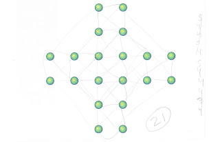
In this activity, we had to figure out how many triangles were in the image. For my friend's approach, she said that it was easier to write down the amount of triangles on the side, so that she wouldn't be confused by a mess of lines crowding the figure. She first counted all the visible triangles, and then counted the remaining triangles as she grouped the smaller ones together in order to visualize the bigger triangles. I did the exact same method, but got confused as I continued to count the remaining triangles due to the clutter of lines. 

In this activity, we had to figure out how many squares we were able to make by connecting the dots to one another. For my friend's approach, she followed the exact method she used in the triangle puzzle. At first, we connected all the smaller squares, and continued to connect the dots that made bigger squares. We both connected all the dots that made each possible square, but like the last puzzle, I lost my square count due to the chaotic mess of scribbles. 

Thursday, October 13, 2011

Feature Hierarchy

The image above carries heavy attention as color and shape are the most powerful feature channels within the poster. As you first glance at the poster, your eyes automatically notice the image of Mickey Mouse that is made up of different types of typefaces. Since Mickey Mouse is placed in the center of a bold and striking background, it attracts the most attention. Our attention then shifts over to the strong shades of pink which is presented in a diagonal form. The vividness of the pink provides an intense outcome as it is the only color that produces a "pop-out" effect. Our eyes then travel across the main image and observes the many fonts that occupy the character's face. As we examine the facial features of the character, the attention focuses heavily on the bold letterings that reside in the character's ears. In the future, I would definitely love to explore my creativity while making posters for Disney. 

Source: http://tutorials-share.com/

Wednesday, October 5, 2011

Top-Down Visual

When I look at this image, my eyes directly focus on the vibrant colors of the makeup. The colors first captures my eye, and then my attention focuses on the more intricate patterns. I follow the pattern down the neck of the woman on the left, and my eyes rest on the excessively long finger nails of the woman on the right. Top-down visual processing operates in this design in that first I take in the image as a whole, then I process the individual components, such as the colors and patterns. After considering the parts of the photograph, I understand the big picture better, realizing the power the bright colors have on the photograph. Without them, the photo would have a darker, almost goth feel, because of the dark lipstick, dull gray lace background, and half-hidden faces of the models. The lace patterns on the faces and necks of the models have the largest density of scan paths.
Source: http://www.makeupstyleideas.com

Tuesday, September 27, 2011

Syntactical Guidelines

The dress pictured is an example of good design because the top portion of the dress has a bold pattern that is both leveled and sharpened. The even, continuous pattern creates leveling as well as a positive and negative effect due to its even dispersal of the colors black and white. Though the top is leveled, it is also sharpened because of the strength of the contrasting colors and rigidity of the lines. The piece contains only solid colors, without fading or gradients. Though this piece has a lot of action in the upper section, it  balances out nicely with the dull, neutral gray, voluminous lower piece, which counteracts the busy top portion with its simple display of stress in the line of buttons.

The couch pictured above is an example of bad design because the color pixels placed on the couch are very scattered and irregular, creating no pattern, balance, or harmony visible to the eye. The stress is very disorganized, causing tension. This is a poor example of leveling due to the distracting nature of the piece. There is no stability in the piece. As a whole, the wide spectrum of colors is presented in a sloppy, disorganized manner that is unappealing and unsettling.

Wednesday, September 21, 2011

Visual Language Syntax

Initial Responses:

Representational:
-job searching
-job vacancies in newspaper
-classified advertising

Symbolism:
-unoccupied
-hope
-opportunity
-epidemic
-depression

The photograph above displays an individual seeking for employment. The photo shows a person looking through the classifieds section of the newspaper with a red marker. Furthermore, the photo strongly concentrates on  the movement of the red marker, as the individual circles the job openings that they are interested in. Since the photo is entirely zoomed in on the newspaper, the result of unemployment show that the individual has already circled three job listings that they are interested in pursuing.

Wednesday, September 14, 2011

MEANING 2

Representational
The photo above displays an advertisement created by the Coca-Cola Company. Along with its unique design, is a representation of a bottled carbonated soft drink. Because the soda bottle is easily recognizable, its main role in the photo is to persuade individuals to drink Coca-Cola. The Coca-Cola bottle and the summertime aspect of the photo affect its viewers because it allows them to envision a good time under the sun accompanied by Coca-Cola. This advertisement leaves room for the abstract and symbolic levels due to its elements and its deeper meaning behind the Company's persuasion.  

Abstraction
The elements of the advertisement interact with one another. The background of the image focuses on a bright luminous sun, creating a stronger hold to its audience. The color combinations provide warmth, affection, and jollity. The abstraction relates to the representational level because of its elements, such as the fancy curves. The fancy and decorative curves denote the significance of Coca-Cola.  As the sun symbolizes life, the abstraction of the sun relates to the symbolic level. 

Symbolism
The content of the advertisement carries a significant amount of symbolism. The role of the glowing sun denotes life and happiness. The summertime aspect plays a huge role in the setting of the advertisement, because it symbolizes radiance, pleasure, and relaxation. The symbolism within this ad is powerful because it entices people into experiencing a joyful time. The symbolic level connects with the representational level because it coincides with the theme of the ad. What is mainly represented and recognizable in the ad is the Coca-Cola beverage, and with the deeper meaning of the symbols, they enable the bottle to stand out on its own. The symbolic level also correlates to the abstract level because the symbolism provided in this ad convey the joys of life, and the elements of the ad also communicates a positive feeling. 

Wednesday, September 7, 2011

MEANING 1

Representation
As you look at the image above, you can easily observe the striking waves moving in sync. This is definitely a representational photo because it allows viewers to clearly recognize and identify what they are actually looking at without question. It carries a great amount of detail by simply being surrounded by the different shades of blue. Although the image is embodied by water, viewers are able to pinpoint that the image portrays an ocean. And because of the fact that there is a large expanse of water presented in the photo, it would be rare for viewers to misinterpret the ocean to a river or a lake. Most importantly, this photo is real specific, leaving it easier for viewers to diagnose. 
Abstraction
In the photo above, is a beautifully painted image of an abstract ocean. This is a great example of abstraction because it is not an accurate representation of an ocean form, but the use of colors and shapes help define what the image is trying to portray. Also, while you glance at the photo, there is a direct connection to our visual perception. This shows that the abstraction derives from a representational form. The structure and the design of the image enables viewers to grasp the main subject of the photo. Most importantly, the flow of the elements, such as the direction and curves of the lines guide the viewer through the image.
Symbolism
The graphic picture above shows people that they are not able to swim in any designated area where the symbol is shown. This is a perfect example of symbolism because it demonstrates "symbolic thinking" and requires people to communicate through coded forms. An individual would be able to decipher the meaning of this symbol because there is a huge red cross over a person who is swimming, denoting that swimming is prohibited. Furthermore, the boldness of the red signals danger, making it easier to catch people's attention. Most importantly, the intention of this symbol expresses meaning. This symbol is symbolic because just like many other symbols, it invites people of all races to understand and convey the same message.