Thursday, October 27, 2011

Movie Posters

In the movie poster above, the element that is mainly portrayed throughout the entire picture is texture. This poster is specifically designed in order to attract the audience of the materials that are used that fill in the main character's face of the movie. The combination of bullets surrounding the character's appearance provides consistency of the surface as it substitutes all the of the characteristics of a human being. The bullets are color coordinated in order to complete the character's hair, face, neck, and suit. The bullets also does a fascinating job creating interest because it carries texture that transmits great detail. The character's face is basically manipulated to provide a feeling of a rough, irregular texture, while the background surrounding the image is smooth and even. Furthermore, the surface of the face appears to be shattered, but it is simply an illusion caused by the associations of materials.
In the movie poster above, the basic element that is active within the image is tone. The intensity of darkness communicate danger and troublesome throughout the entire design. If one were a stranger to the Batman trilogy, they can easily observe that this movie involves a grungy atmosphere due to its tone. In the image, you can notice that the darkness builds on the lines of the buildings and the character placed in the center of the poster is toned down and is dressed heavily in dull, lifeless colors. Lastly, the color scheme and cant of the camera create an ominous effect.
In the movie poster above, the basic element that is active is scale. The gnome that is centered in the middle of the poster is humongous relative to the minuscule gnomes surrounding him. Though the main gnome isn't actually that much larger in comparison, it is enlarged in the poster to emphasize the contrast between the red and blue gnomes. Juxtaposition takes place as the main gnome stands side by side with other gnomes. 


Thursday, October 20, 2011

Visual Thinking Research


In this activity, we had to figure out how many triangles were in the image. For my friend's approach, she said that it was easier to write down the amount of triangles on the side, so that she wouldn't be confused by a mess of lines crowding the figure. She first counted all the visible triangles, and then counted the remaining triangles as she grouped the smaller ones together in order to visualize the bigger triangles. I did the exact same method, but got confused as I continued to count the remaining triangles due to the clutter of lines. 

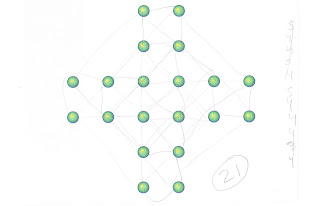
In this activity, we had to figure out how many squares we were able to make by connecting the dots to one another. For my friend's approach, she followed the exact method she used in the triangle puzzle. At first, we connected all the smaller squares, and continued to connect the dots that made bigger squares. We both connected all the dots that made each possible square, but like the last puzzle, I lost my square count due to the chaotic mess of scribbles. 

Thursday, October 13, 2011

Feature Hierarchy

The image above carries heavy attention as color and shape are the most powerful feature channels within the poster. As you first glance at the poster, your eyes automatically notice the image of Mickey Mouse that is made up of different types of typefaces. Since Mickey Mouse is placed in the center of a bold and striking background, it attracts the most attention. Our attention then shifts over to the strong shades of pink which is presented in a diagonal form. The vividness of the pink provides an intense outcome as it is the only color that produces a "pop-out" effect. Our eyes then travel across the main image and observes the many fonts that occupy the character's face. As we examine the facial features of the character, the attention focuses heavily on the bold letterings that reside in the character's ears. In the future, I would definitely love to explore my creativity while making posters for Disney. 

Source: http://tutorials-share.com/

Wednesday, October 5, 2011

Top-Down Visual

When I look at this image, my eyes directly focus on the vibrant colors of the makeup. The colors first captures my eye, and then my attention focuses on the more intricate patterns. I follow the pattern down the neck of the woman on the left, and my eyes rest on the excessively long finger nails of the woman on the right. Top-down visual processing operates in this design in that first I take in the image as a whole, then I process the individual components, such as the colors and patterns. After considering the parts of the photograph, I understand the big picture better, realizing the power the bright colors have on the photograph. Without them, the photo would have a darker, almost goth feel, because of the dark lipstick, dull gray lace background, and half-hidden faces of the models. The lace patterns on the faces and necks of the models have the largest density of scan paths.
Source: http://www.makeupstyleideas.com